In the kingdom of Helvetica, A2M chose to lead a new visual revolution.
June 30,2025
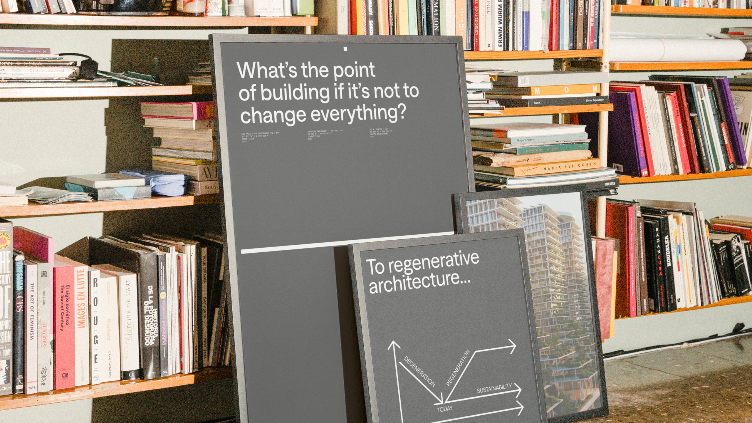
A2M — Building a brand as bold as the buildings.
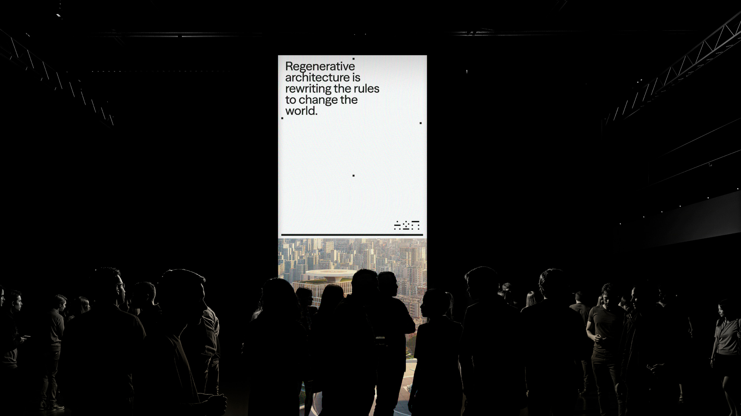
In a landscape dominated by Helvetica-heavy templates and interchangeable architecture studios, we reflected on ourselves — not just through what we build, but through how we see, and how we choose to be seen. As pioneers in regenerative architecture for over 25 years, we have consistently pushed sustainable design forward with a strong track record in energy-efficient, future-ready buildings. Now, our image evolves with our impact.
Our latest brand evolution is not about breaking codes for the sake of it — it’s about understanding them and pushing them further. What does it mean to be an architecture firm today? What do we stand for when we build the future? What kind of visual and verbal language reflects a team designing for the next 50 years?
Positioning & Strategy:
Where vision meets trust.
The first step was to rethink how we position ourselves internally and externally. For our team, clients, and peers alike, we needed a positioning that remains rooted in our legacy yet inspires what’s next. Together with Stoëmp Studio, we developed a clear short- and long-term strategy that combines our brand essence and notoriety. The result is a hybrid model inspired by the radical interdisciplinary spirit of Neri Oxman and the activist audacity of Sea Shepherd — combining systemic vision, experimental mindset, and a bold graphic touch.
At our core remain two pillars: Vision and Trust. Architecture as an alchemy of art, science, and engineering.
Tone of Voice: No more Déjà-Lu.
Generic, passive descriptions no longer serve us. Our new tone of voice is as distinctive as our work: provocative yet precise, playful yet professional, visionary but grounded. We choose language that stays accessible and impactful, avoiding the trap of over-intellectualizing regenerative architecture.
Brand & Digital Identity:
Complex simplicity.
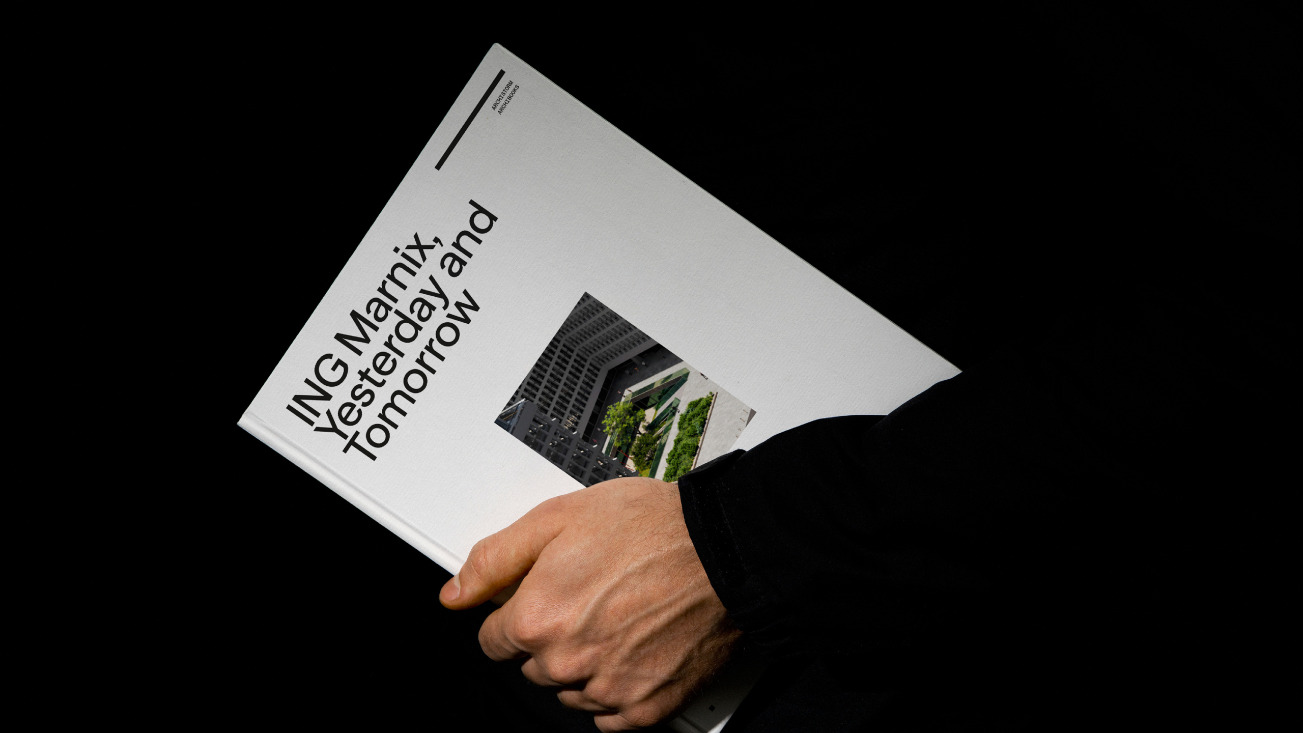
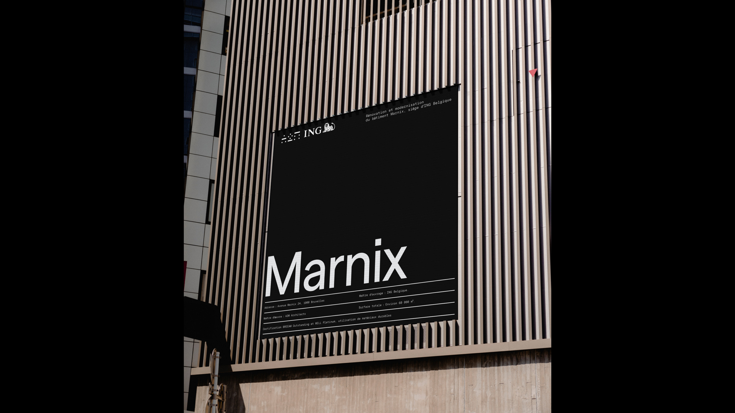
Most architecture firms look the same — same fonts, same layouts, same endless slideshows of 3D renderings. We wanted more. We needed a pioneering visual identity to match our pioneering spirit. Our new logo is disarmingly simple yet built on layers of complexity, referencing data-driven design, aerial cityscapes, and artistic inspirations like Morandini.
This is not minimalism for minimalism’s sake. It’s maximum meaning, distilled. From business cards to project presentations and internal templates, every touchpoint has been reimagined to empower our team and keep us anchored to a clear, recognizable system.
Social Media & Brand Notoriety:
Resetting the narrative.
Our online presence had faded into the background. We started from almost zero, approaching social media with a clear strategy: don’t chase trends, build substance. We developed an editorial framework based on strategic consistency, not influencer pacing. We introduced bold new references like Kasia Szybka to bring visual and conceptual dynamism into the mix. We defined realistic, sustainable publishing rhythms, guided by KPIs, our audience, and the clear aim to grow not just visibility, but credibility.
Digital Flagship:
A website that balances form & function.
This website is more than a portfolio. It’s our Digital HQ, designed to reflect who we are, what we believe, and what we build. It had to communicate with decision-makers and design-lovers alike. We redesigned the entire user experience with a focus on aesthetics, clarity, and impact. Every project page was reworked. Every text was rewritten. Content strategy was developed based on real user journeys and SEO research. The next phase is already in motion: realtime climate data integration, and a digital reinterpretation of our Ice Box Challenge, turning architectural performance into an interactive experience.
Designing for what comes next.
We continue to look for what sustainable architecture can look like. This new brand identity is not a facelift — it’s a foundation for what’s next. It’s a complete ecosystem where strategy, visuals, voice, and digital storytelling come together to push the field forward — not just to stand out, but to stay true. Because for us, a brand, just like a building, must be designed for what’s next.